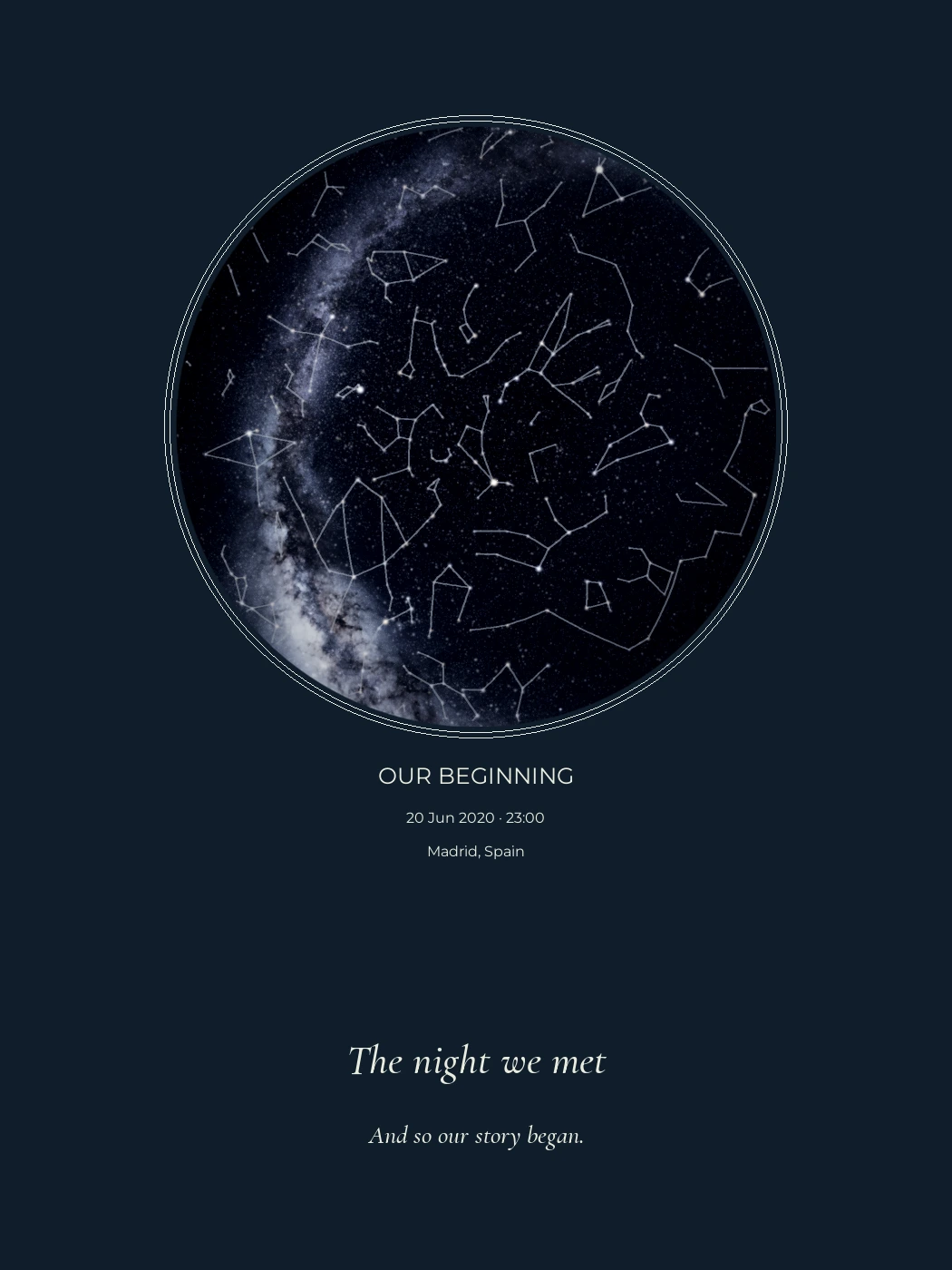
What is a personalized star map, and how is it calculated?
Published and reviewed on
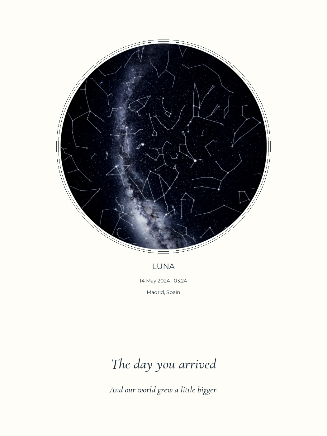
Not a physical print sample.
A personalized star map represents celestial positions for a chosen date, time and location. It combines that calculation with a layout and personal words. It is neither a historical photograph nor an astrology chart.
The circle is the most visible part of the artwork. Behind it sit several decisions: which objects to include, where the observer stands and how to draw a curved sky on a flat page. Understanding them helps you choose a map with clear expectations.
What a star map represents
A sky chart places stars and other objects within a coordinate system. A local chart relates those positions to an observer’s horizon. Personalization adds the occasion, place, names and appearance.
A decorative star illustration can be attractive without representing a date. A rotating planisphere helps a reader find regions of the sky at different dates and times. An astrology chart assigns meanings to celestial positions; KeptStars does not do that.
The word “personalized” alone tells you little about the calculation. Look for the catalogue, method and limitations. A pleasing image does not establish how accurately it represents an event.
From a date to a drawing
- Start with a catalogue. It supplies star positions and other data. KeptStars uses HYG, which brings together astronomical information from several sources.
- Interpret the time. A local clock time and its time zone identify the instant used in the calculation.
- Place the observer. Latitude and longitude determine how the sky relates to the local horizon.
- Project the sky. A projection turns a curved view into a flat circle. It cannot preserve every distance and shape at once.
- Compose the artwork. Add the words, colours and chosen layers.
Our browser preview uses a stereographic projection and stars down to approximately magnitude 6.5. Magnitude measures brightness: a lower number means a brighter star. Including a star in the drawing does not mean a person could see it from a brightly lit city.
How to read our circular charts
The centre is the zenith, the point directly overhead. The rim is the geometric horizon. North sits at the top; east is on the left, following this skyward-looking convention. A star’s drawn size represents brightness, not its physical diameter.
Check orientation and projection before comparing two providers. Their charts may look different even for the same moment. To isolate the effect of time, keep the location and layout unchanged, as in our Madrid example six hours apart.
A layout preview and a rendered artwork have different detail
The designer uses a fast star chart to help you adjust the composition. It uses J2000 catalogue positions without effects such as precession, proper motion or atmospheric refraction. These limits matter if you expect an observatory-level model.
The separate rendering process can add a Milky Way panorama, the Moon and planets. It uses tools including Skyfield and NASA/JPL ephemerides. The Skyfield documentation explains how catalogue star positions are handled.
Moon and planet images are enlarged for legibility. Their textures are illustrative, not photographs taken on your chosen date. The Milky Way panorama has roughly one to two degrees of local alignment uncertainty. We describe these choices on the astronomy and credits page.
What the map cannot tell you
Calculated position is not the same as actual visibility. Clouds, daylight, hills, buildings and light pollution affect what someone can observe. Our maps do not reconstruct those conditions.
You can therefore calculate a chart for a mid-morning birth. It shows positions for that time even though many stars would not be visible. If the time is unknown, an illustrative reference must stay labelled as such.
Personalizing a map does not name a star officially or confer ownership of it. The personal elements are the chosen moment, layout and words.
What to check before choosing
Look for editable event details, a time you understand, readable labels and an accessible explanation of the method. Then choose layers that help you read the design. Constellation lines and a coordinate grid can orient the eye; if they compete with the words, try simplifying.
Explore the personalized map options with those checks in mind. Before printing, distinguish a web preview from a final file: the printing guide explains size, resolution and fit.
How accurate is the star map?
The preview calculates a local sky from catalogue positions, with limits explained on our astronomy page. It omits precession, proper motion and atmospheric refraction. Rendered Moon and planet images are enlarged; the Milky Way panorama has about 1–2 degrees of local alignment uncertainty.
Is this an astrology chart or a way to name a star?
Neither. KeptStars creates astronomical artwork for an event. It does not interpret horoscopes, assign official star names or transfer ownership of a star.
Why do the examples look different from the designer?
The designer draws a fast catalogue-star preview. Rendered examples can include the Milky Way, Moon and planets through a separate process. Selecting a layer does not mean that the browser preview already renders it.
Sources and notes
Recommendations are from KeptStars’ editorial team. Product details describe the version reviewed on 16 September 2026; availability and options may change.